Travel Visual Reconstruction and Interpretation
EXPERIMENTAL ART DESIGN/GRAPHIC DESIGN · Travel Visual Reconstruction and Interpretation
“TRAVEL”
VISUAL RECONSTRUCTION AND INTERPRETATION
From Graphic Design, School of Design, Nanjing University of the Arts
TRAVEL - MEASURING THE WORLD BY THE FOOTPRINT
People have never stopped their steps of exploring the world since the world began. In ancient times, primitive men migrated for living. During the great navigation times, people opened up new route to explore the world and find precious deposits. Entering to the feudal age, people started the travel of preaching their religion and spreading civilization. In the modern society, we still have people who are willing to abandon themselves to nature and to wander far away from home. The meaning of travel is not just limited to exploration. What’s more, it could help to balance and enrich people’s inward world.

RESEARCH FROM THE PERSPECTIVE OF MAP AND PEOPLE

Map

People
EXPERIMENTAL ART DESIGN

Poster Design

Book Design

Media Design
I make visual reconstruction and analysis of travel, including the map, path and people. After investigation and survey, I decide to make the research from the perspective of map and people, for example, Columbus, Magellan, Vasco da Gama and Dias.
For the visual effect, I make some attempts of print books design and three dimensional books design. In addition, the hollowed-out skill and folding skill are also used. What’s more, animation and new media bring a kind of breakthrough. Finally, the posters are made by new materials and printing technology, for example, using acrylic material to print white and silver patterns.

POSTER DESIGN


Images made of square bitmaps constitute a layer of the poster
Words describing the theme constitute another layer.
There’re three posters—COLUMBUS, JOURNEY, DARWIN. Images made of square bitmaps constitute a layer of the poster while words describing the theme constitute another layer. Two layers overlap and create an unique effect.
In addition, the new skill of using acrylic material to print silver and white patterns is used. The acrylic material is transparent. Therefore, I adopt two layer pictures to make three effects. The first is that I print the white pattern and silver Chinese characters on the positive side of the acrylic materials; the second is that I print the white pattern and the silver Chinese characters on the reverse side of the acrylic material; the third is that I print the white pattern and silver Chinese characters on the positive side and reverse side of acrylic material respectively.

COLUMBUS: I use hemp rope to make pattern of cross on the spine and cover of the handmade map atlas. This is a kind of new attempt. In addition, I combine it with Columbus, the famous explorer. Then, the poster is formed, which not only tells the greatness and difficulty of sailing adventure, but also presents the three-dimensional patterns and textures in the plane.
ORIGIN OF SPECIES: It uses the method of designing grid of Bauhaus. Colors such as black, white, grey and yellow are used to separate the grid. In addition, with the combination of virtual and real animal patterns, it is well arranged and overlapped. Finally, this Origin of Species is finished.
SAIL THE OCEAN: It is still the grid style. Circle is the main pattern. The image of Europe ship and the background map act in cooperation with each other. In addition, a blue grid pattern breaks the dull color of the whole poster.

BOOK DESIGN
JOURNEYS OF EXPLORE
Type: book design
Paper: 125g Boran
Number of pages: 110
Book size: 280mm*335mm
Bookbinding: hand binding
Time: 12/2015-06/2016
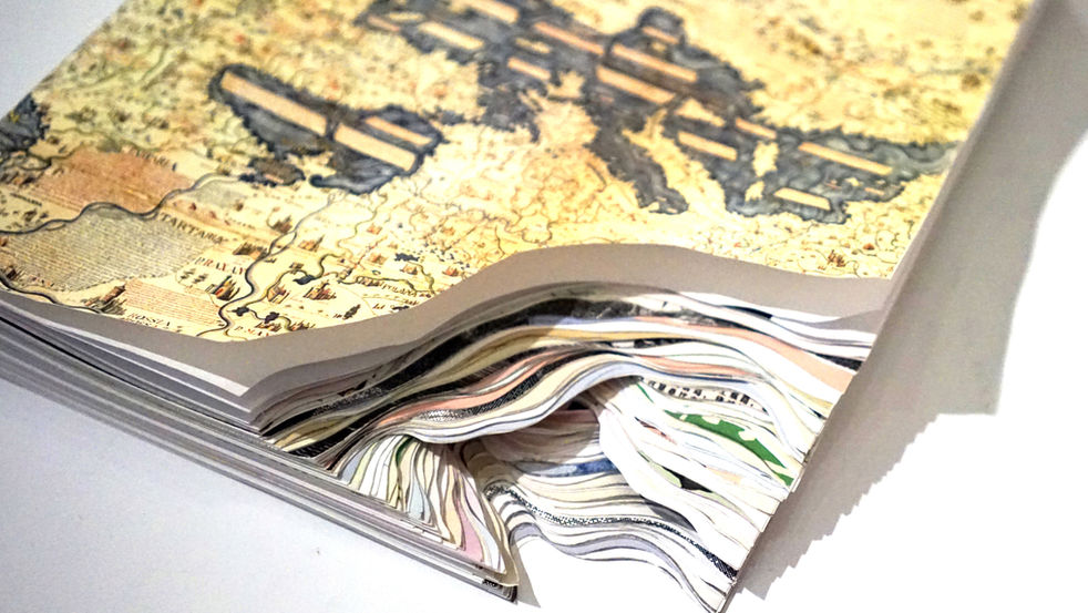
Journeys of Explorer is called Qiusuo (means seeking and searching) before. For the first draft of this book, I persisted in grid layout while the design of inside pages and page number was a little bit reserved and lacked features. Under the guide of teacher Cao, I paid attention on the repetition of lines and made the second draft. Afterwards, I kept thinking that how to make the book more readable and how to break through the original form of book. Then, I finished the third and fourth draft. Finally, the book was named Journeys of Explorer.
In addition, for bookbinding, the hand thread binding formed the shape of “QIUSUO”.The step-like hollowed cuboid in the middle broke the traditional type of book and created a sense of layering.
MAP
Type: book design
Paper: 250g Boran
Number of pages: 150
Book size: 150mm*180mm
Bookbinding: hand butterfly binding
Time: 06/2016
Map is developed from labels and figure images. Single label is used to make the inside page. Here I didn’t use mixed techniques . The printing effect of figure image was emphasized. For Map, figure image and using labels to present verbal content are its characteristics. In addition, skills of making part hollowed were used, which created a layered effect.
The feature of this book is that it boasts a strong sense of form. The book itself is an inclusive map.
VASCO DA GAMA
Paper: 125g Boran, 70g parchment paper
Number of pages: 150
Book size: 210mm*297mm
Bookbinding: hand butterfly binding
Time: 2016.2-2016.5
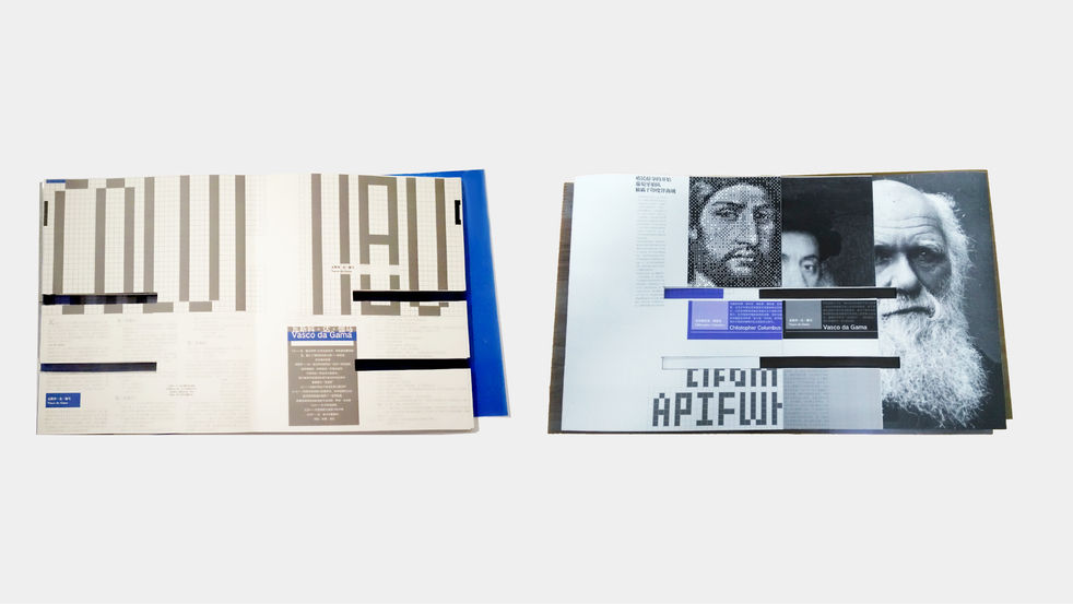
The first draft of Vasco da Gama used A4 paper, which was filled with maps, figures, animals, plants and tools. Then the paper size was enlarged to A3 and words were added, which showed the relationship between words and pictures. The second draft emphasized the choice of words and added some semitransparent pictures, which was a great challenge.
I made attempts of the fluency and lens feeling of reading, the choice of material, and the overall form of book again and again, and got the results.
EXPLORER is developed from figure image and mosaic font. The whole shape comes from the initial of the title “E”, implying explorer. The hollowed design separates the book into three strips, each of which could be read independently. This is a great characteristic. In addition, there’s a head portrait of Darwin on the cover, which is covered by blue film and a book jacket of mosaic font. Such design highlights its features and gives people a modern sense. For the design of inside pages, blue and grey films are used several times to improve visual effect.
EXPLORER
Paper: 125 Boran and Film
Number of pages: 150
Book size: 150mm*180mm
Bookbinding: hand butterfly binding
Time: 2016.5

MEDIA DESIGN
One attempt of new media is to show the life story of Columbus in the form of animation, which is to design story board graphics in AI, design smooth plot in AE, and finally complete the short animation.
COLUMBUS 1451 -- 1506
EXHIBITION
According to my understanding of the theme, I finish the reconstruction and interpretation from 15 angles. And the breakthrough of technology and new media is also what I want to make. Finally, a series of design is completed successfully, including 11 book type settings, 6 posters and several derivatives.
In the graduation project design, I hold the post of leader of the team. I take the initiative to communicate with them, help them out and overcome the difficulties together. Though our first design arouses the sponsor’s interest, they still propose many suggestions. To attain the best effect, our team rearranges the plan, revises design and edition overtime. As a resuit, our proposal stands out and presents pretty good visual effect.


